Migration Assistant UX Case Study
Project Summary
Redesign the cluster scanning and mapping workflow for the cloud migration tool
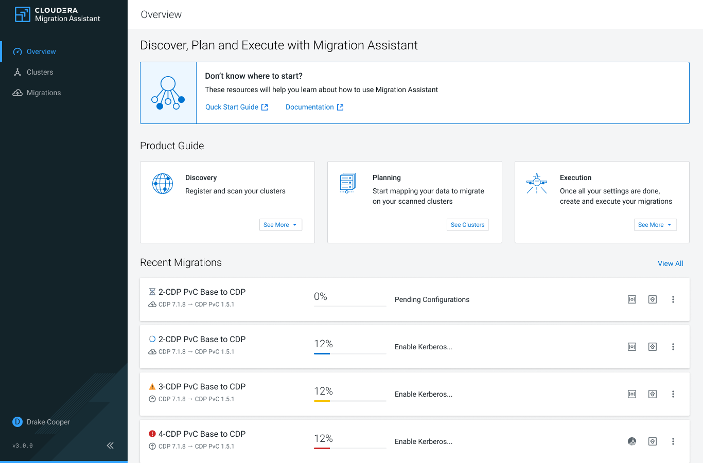
 Cloudera Migration Assistant Home Page – Image courtesy of Cloudera
Problem Statement & Solution
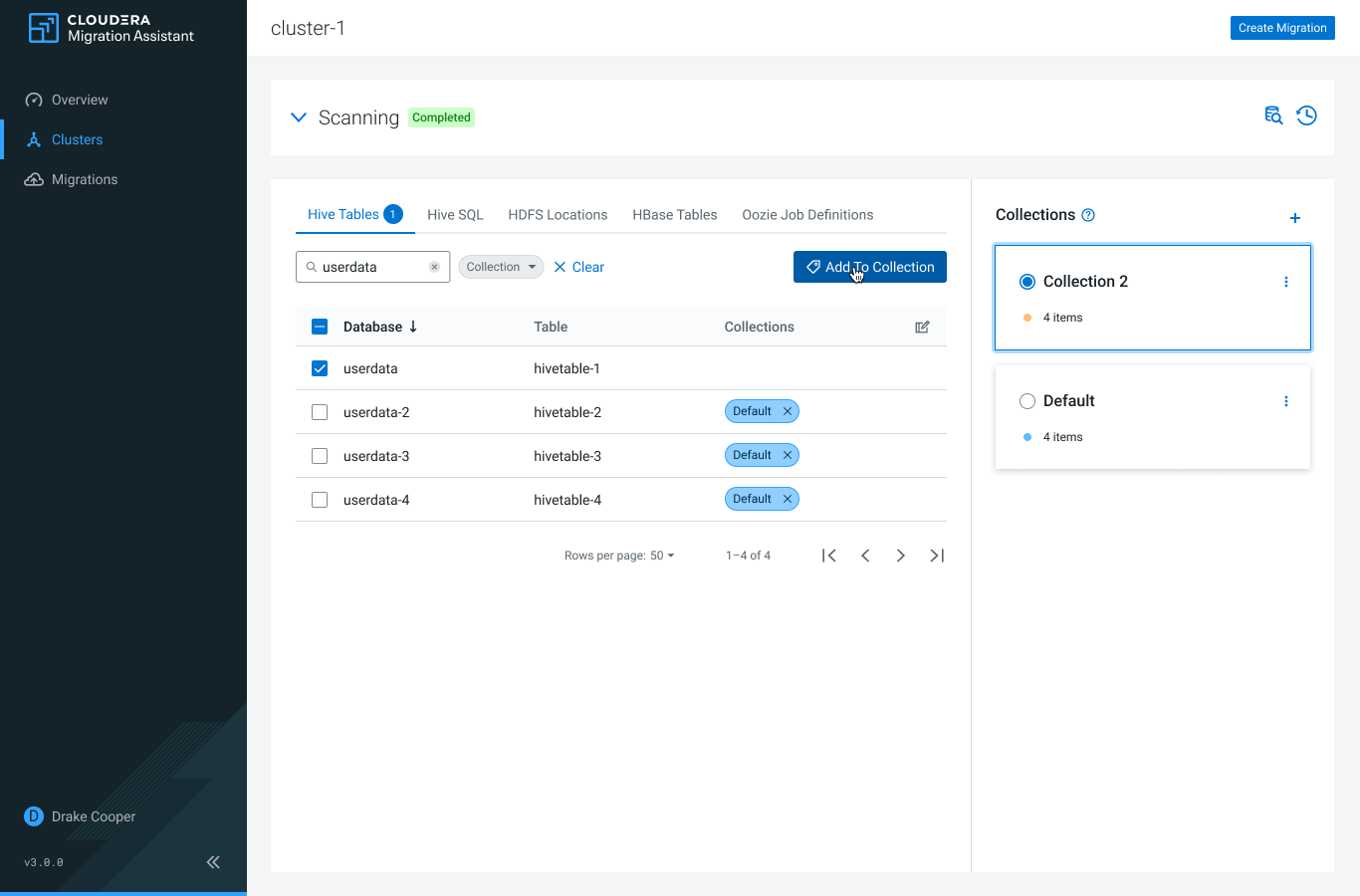
Before the tool reached its general availability, Migration Assistant had many design debts that had to be addressed. One of the most critical functionalities is cluster scanning and mapping, which are hard to use and not consistent with the design language of the platform. As a solution, the team built a semantically structured, optimized interface for these functionalities that gives step-by-step instructions and meaningful indicators to the users who perform these complicated tasks. The outcome simplifies mapping data into an online shopping experience.
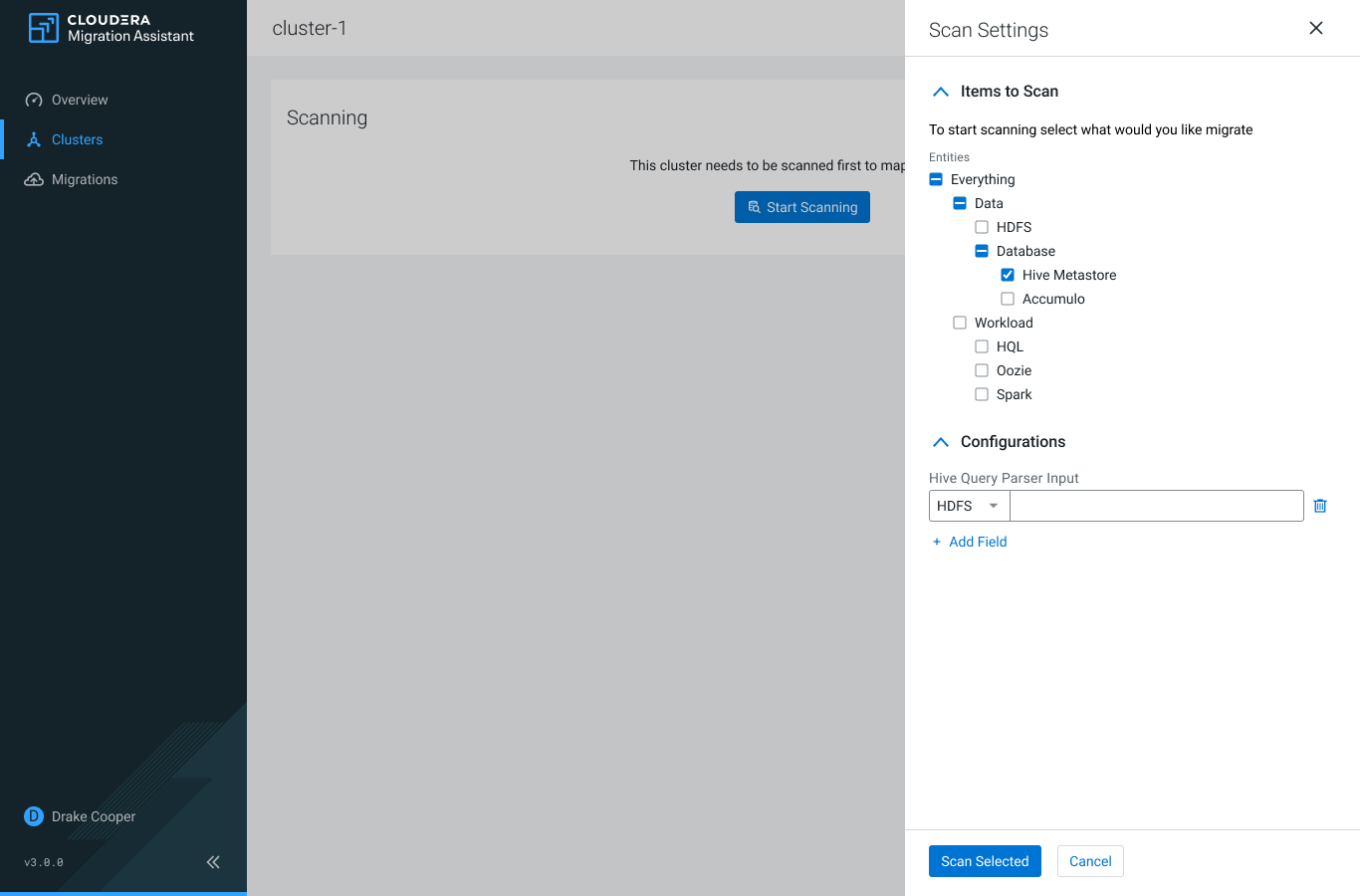
 Redesigned Scanning Options presented in a drawer panel – Image courtesy of Cloudera
